Squircle Shape
An Android Jetpack Compose library providing customizable Squircle shapes for UI components.
Why Squircle?
- The squircle is an intermediate shape between a square and a circle, present in digital and real products as well.
- Whereas the corners of a rounded square remain at 90 degree angle, the edges of a squircle curve smoothly outwards from each corner, forming an arc, thus creating an optically pleasing shape.
- Currently, there aren’t any squircle shapes in Android out of the box. That’s why this project was created, with the main goal being to provide an easy implementation of a squircle shape for UI components built with Jetpack Compose.
Requirements
- Project Min SDK version –
23 - Jetpack Compose version –
1.4.3 - Jetpack Compose Compiler version –
1.4.7 - Kotlin version –
1.8.21
Gradle Kotlin DSL Setup
Step 1
- Add the Jitpack maven repository in your
settings.gradle.ktsfile.
repositories {
    maven(url = "https://jitpack.io")
}
Step 2
implementation("com.github.stoyan-vuchev:squircle-shape:1.0.2")
- Or if you’re using a version catalog (e.g.
libs.versions.toml), declare it there.
[libraries]
squircle-shape = { group = “com.github.stoyan-vuchev”, name = “squircle-shape”, version.ref = “squircle-shape” }” style=”box-sizing: border-box; margin-bottom: 16px; color: rgb(36, 41, 46); font-family: -apple-system, BlinkMacSystemFont, “Segoe UI”, Helvetica, Arial, sans-serif, “Apple Color Emoji”, “Segoe UI Emoji”; font-size: 16px; font-style: normal; font-variant-ligatures: normal; font-variant-caps: normal; font-weight: 400; letter-spacing: normal; orphans: 2; text-align: start; text-indent: 0px; text-transform: none; widows: 2; word-spacing: 0px; -webkit-text-stroke-width: 0px; white-space: normal; background-color: rgb(255, 255, 255); text-decoration-thickness: initial; text-decoration-style: initial; text-decoration-color: initial;”>
[versions]
squircle-shape = "1.0.2"

[libraries]
squircle-shape = { group = "com.github.stoyan-vuchev", name = "squircle-shape", version.ref = "squircle-shape" }
- Then include the dependency in your module
build.gradle.ktsfile.
implementation(libs.squircle.shape)
Step 3
- Sync and rebuild the project.
Gradle Groovy Setup
Step 1
- Add the Jitpack maven repository in your project (root) level
build.gradlefile.
allprojects {
    repositories {
        maven { url 'https://jitpack.io' }
    }
}
Step 2
implementation 'com.github.stoyan-vuchev:squircle-shape:1.0.2'
Step 3
- Sync and rebuild the project.
Usage
- For components, use
SquircleShape(), which comes in multiple variants for multiple use cases, so different variants have different parameters (percent: Float, radius: Dp, etc.). - However, there is a single common parameter in all variants –
cornerSmoothing: Float. - The
cornerSmoothingas you may have or may have not guessed, is responsible for adjusting the smoothness of the corners, the foundation of every squircle shape. - Take a look at the SquircleShape.kt file for more information.
- For a single percent based corner radius, use the variant of
SquircleShape()withprecent: IntandcornerSmoothing: Floatparameters.
SquircleShape(
    percent = 100,
    cornerSmoothing = 0.72f
)
- There are also a pixel (Float) and dp (Dp) based variants.
- For a multiple percent based corner radii, use the variant of
SquircleShape()withtopStart: Int,topEnd: Int,bottomStart: Int,bottomEnd: Int, andcornerSmoothing: Floatparameters.
SquircleShape(
    topStart = 50,
    topEnd = 10,
    bottomStart = 50,
    bottomEnd = 10,
    cornerSmoothing = 0.72f
)
- There are also a pixel (Float) and dp (Dp) based variants.
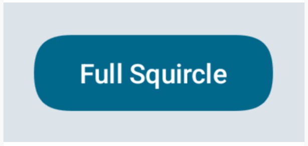
- Here is an example use of a Button using the default
SquircleShape().
Button(
    onClick = { /* Action */ },
    shape = SquircleShape() // Fully rounded squircle shape.
) {
    Text(text = "Full Squircle")
}

- This is an example of Image clipped to the default
SquircleShape().
Image(
    modifier = Modifier
        .size(128.dp)
        .clip(shape = SquircleShape()), // Clipped to a fully rounded squircle shape.
    painter = painterResource(R.drawable.mlbb_novaria),
    contentDescription = "An image of Novaria.",
    contentScale = ContentScale.Crop
)

- There is also a support for drawing squircle shapes in Canvas –
drawSquircle(). - All methods for creating a squircle shape use the
squircleShapePath(). You can find it inside the SquircleShapePath.kt file.
License
This project is open source and available under the MIT License.
Contact
Created by @stoyan-vuchev – feel free to contact me! E-mail – contact.stoyan.vuchev@gmail.com